Design System, E-commerce Website
2018
Creation and maintenance of an enterprise-level design system for an e-commerce website.
Role: UX/UI designer
Tools: Whiteboards, Sketches, Google Docs, Axure, Sketch, Confluence
What triggered the creation of a design system?
![]()
Objectives:
Step 3: Create a structure.
We benchmarked other design systems to see how teams were organizing and categorizing their UI. I partnered with a developer to evaluate our front-end architecture and align the system categories accordingly.
![]()
Step 4: Consolidate existing content.
Our teams had several sources of truth so we used Google Docs to aggregate information which aligned to the agreed upon information architecture. This document was shared so team members could track progress and comment, as needed.
![]()
Step 5: Determine guiding principles.
I set up time for key stakeholders to brainstorm site experience principles. The goal was to describe the best qualities of the site today, but also lay the foundation for future experiences. I provided references to other systems principles such as Trello and Pinterest and created a template to help facilitate the brainstorm. This session resulted in three principles that provided a shared perspective and point of view for future experience strategy, creative direction, etc.
![]()
Step 6: Conduct extensive UI audit.
Some parts of the system were working well and easy to document. However there were some key areas that lacked clarity, resulting in multiple versions of the same component. From this audit, I identified some core elements that warranted immediate discussion.
![]()
Step 7: Align on foundations and core elements.
We walked through the “source of truth” document, which outlined the holistic point of view on visual hierarchy and design. This initial discussion helped the team align on the need to create a cohesive experience across the site. We then had more detailed discussions about specific components such as buttons (styles, descriptions, usage), headings (fonts, styles, standards), and links.
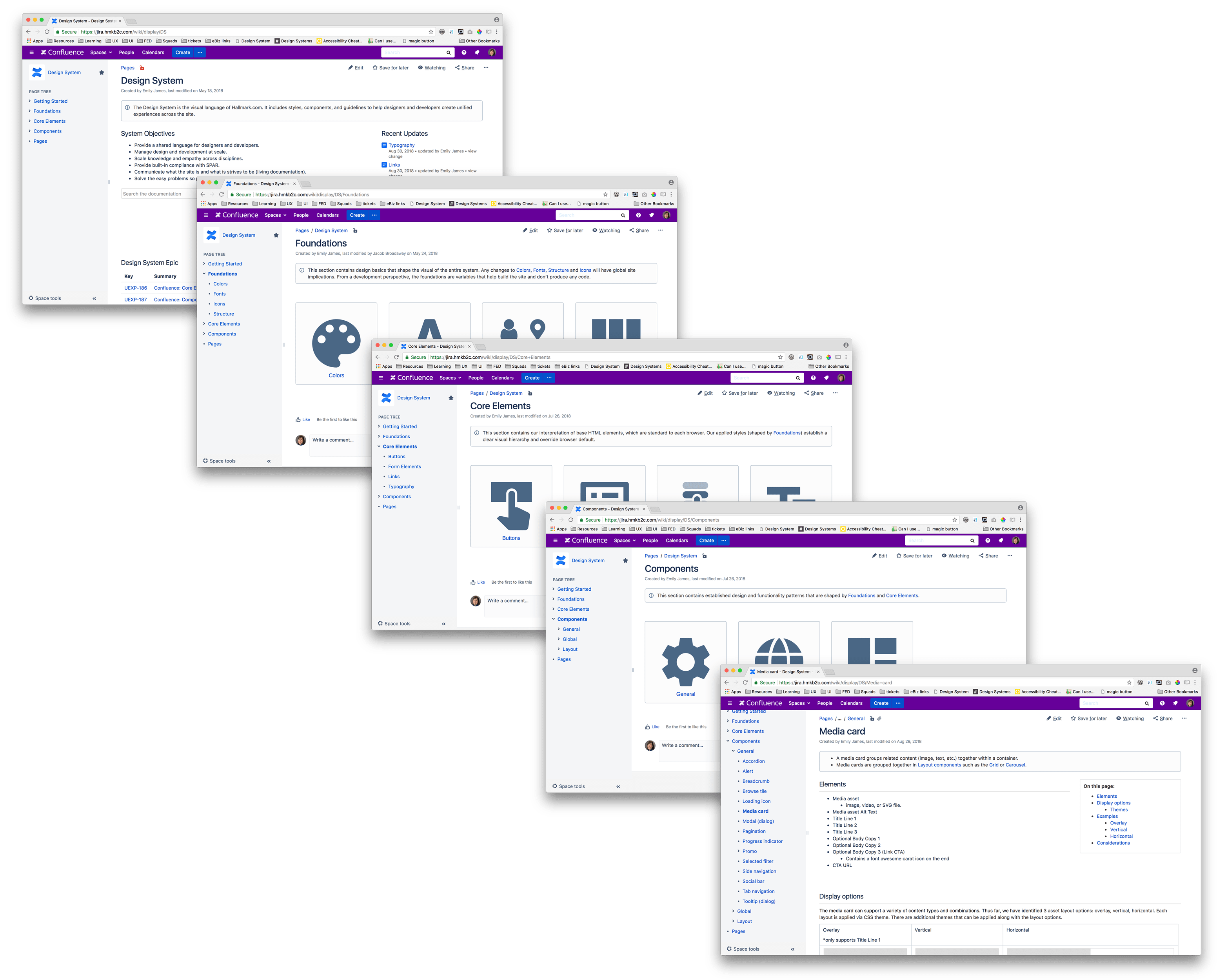
Step 8: Refine the documentation.
Our product teams use JIRA for ticket tracking and Confluence for collaborative documentation, so we decided an official first version of our design system would live in Confluence.
![]()
Creation and maintenance of an enterprise-level design system for an e-commerce website.
Role: UX/UI designer
Tools: Whiteboards, Sketches, Google Docs, Axure, Sketch, Confluence
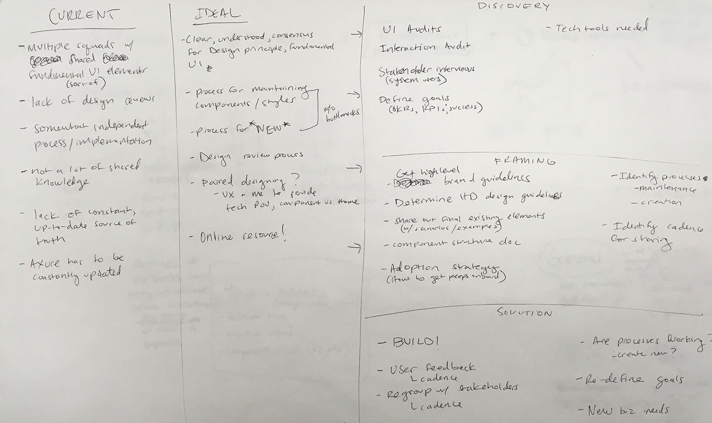
What triggered the creation of a design system?
- Multiple product squads with independent processes.
- Lack of shared knowledge.
- Difficulty with maintaining an up-to-date source of truth.
Step 1: Educate the team.
The team did research using various webinars, books, and articles including:- Initiating a Design System for the Enterprise from NNg
- Design systems—Zero to one
- Creating a Design System: A Practitioner's Case Study
- Design Systems book.
Step 2: Identify system definition and objectives.
A design system is a visual language comprised of styles, components, and guidelines to help designers and developers create unified experiences.Objectives:
-
Provide a shared language for designers and developers.
- Manage design and development at scale.
- Scale knowledge across disciplines.
- Communicate what the site is and what it strives to be.
- Solve the easy problems so product squads can solve the hard ones.
Step 3: Create a structure.
We benchmarked other design systems to see how teams were organizing and categorizing their UI. I partnered with a developer to evaluate our front-end architecture and align the system categories accordingly.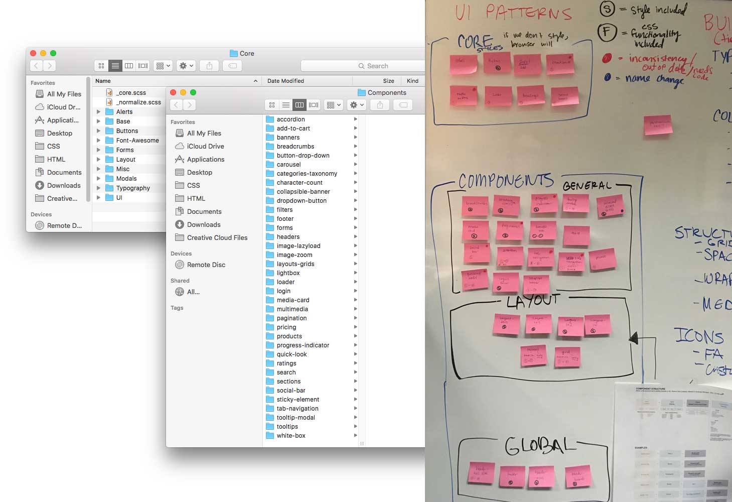
Step 4: Consolidate existing content.
Our teams had several sources of truth so we used Google Docs to aggregate information which aligned to the agreed upon information architecture. This document was shared so team members could track progress and comment, as needed.
Step 5: Determine guiding principles.
I set up time for key stakeholders to brainstorm site experience principles. The goal was to describe the best qualities of the site today, but also lay the foundation for future experiences. I provided references to other systems principles such as Trello and Pinterest and created a template to help facilitate the brainstorm. This session resulted in three principles that provided a shared perspective and point of view for future experience strategy, creative direction, etc.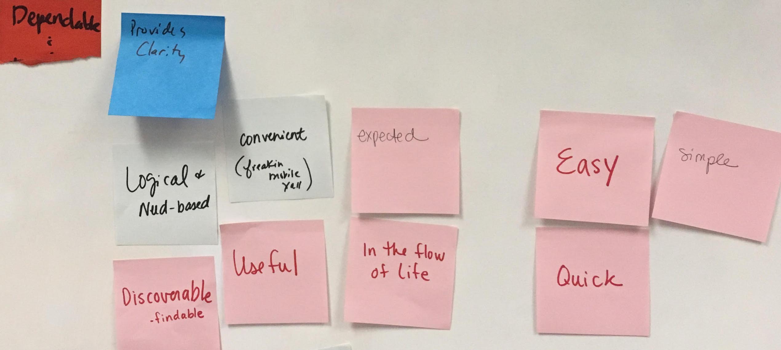
Step 6: Conduct extensive UI audit.
Some parts of the system were working well and easy to document. However there were some key areas that lacked clarity, resulting in multiple versions of the same component. From this audit, I identified some core elements that warranted immediate discussion.
Step 7: Align on foundations and core elements.
We walked through the “source of truth” document, which outlined the holistic point of view on visual hierarchy and design. This initial discussion helped the team align on the need to create a cohesive experience across the site. We then had more detailed discussions about specific components such as buttons (styles, descriptions, usage), headings (fonts, styles, standards), and links.Step 8: Refine the documentation.
Our product teams use JIRA for ticket tracking and Confluence for collaborative documentation, so we decided an official first version of our design system would live in Confluence.
Step 9: Create internal tools for faster design.
In conjunction with the Confluence documentation, I created various tools to help expedite the design process including:- Axure widget library and file template
- Sketch symbols and file template
- Photoshop component templates