Hallmark Component-Based Design
Component creation and iteration in support of all Hallmark.com product squads to ensure there is a cohesive, scalable approach to design and development.
Roles: UX/UI designer, QA
Tools: Axure, Confluence, Photoshop
We receive ideas for features and iterations from a variety of sources including:
- user testing insights
- analytics observations
- business and merchandising needs
- digital trends and competitive benchmarks
When we identify a valid user or business need, we come up with solutions as a team.
Concept sketches
The team brainstorms and sketches potential solutions along with key stakeholders. Whether we’re discussing an entirely new feature, a small enhancement to something existing, or a new content configuration, we start with sketches to quickly align and move into the next phase of delivery work.
High-fidelity prototypes
Depending on the type of solution, we move into a high-fidelity prototyping phase to validate the solution with users and business leaders, as needed. During this phase we also work through and begin to document necessary content specifications, data configurations, etc.Integration & documentation
Once we have a valid solution via sketch, comp, and/or prototype, we move into the final delivery support phase: integration work with product squads followed by Confluence documentation.Example
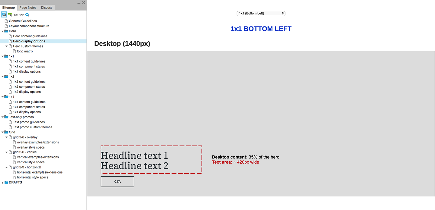
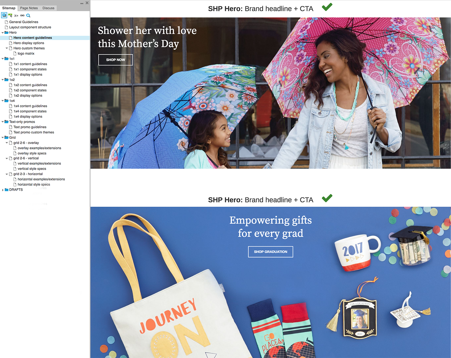
The Hallmark.com team categorizes components into three groups: General, Global, and Layout. The Layout components offer the most flexibility in terms of display and are fed by smaller components that comprise the General category. Through iterative development we streamlined all layout components to share one, consistent codebase. This structure enhancement allows for future flexibility in terms of theming and interaction. The sketches and chart below show how we worked through the configuration to define the layout component structure.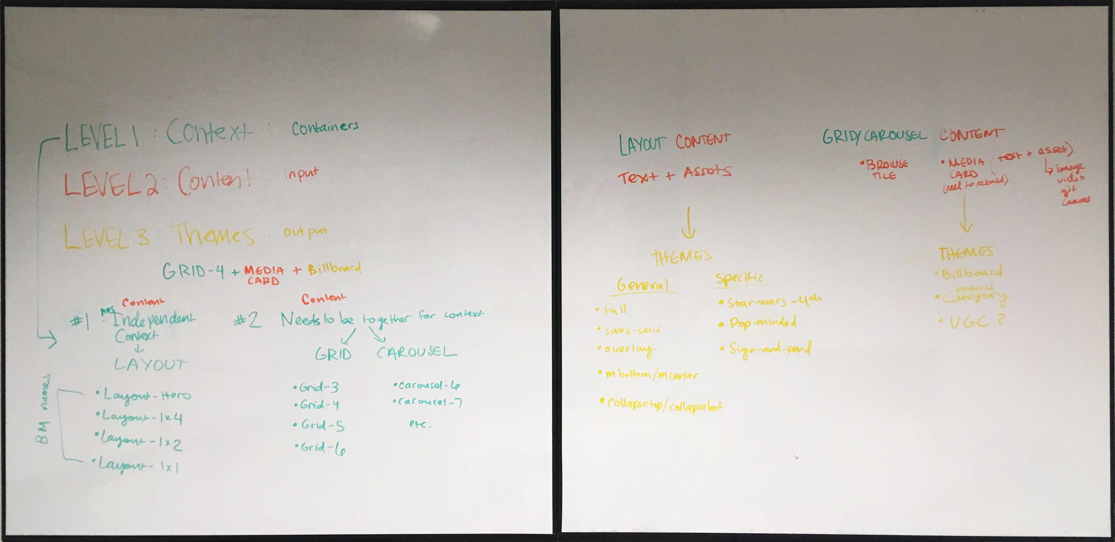
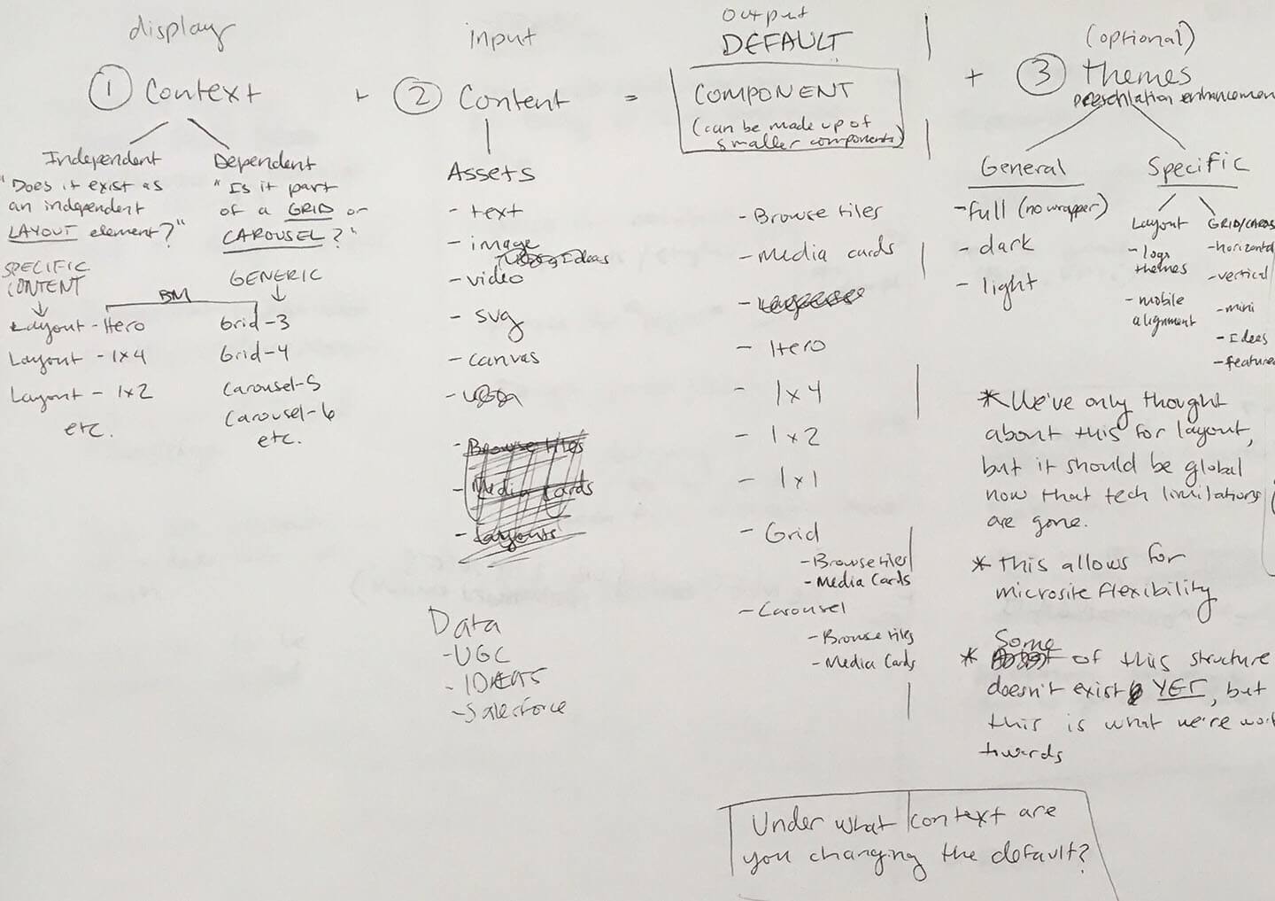

“Content” refers to various asset and data combinations. “Display” refers to the containing element that houses the content such as a grid or carousel.