Hallmark Web Accessibility
2018
Efforts to meet accessibility standards across Hallmark.com in order to better serve and support all customers.
Role: UX/UI designer
This year the UI Engineering team helped prioritize and deliver several accessibility updates for Hallmark.com. These updates delivered on other technical standards related to site performance and responsiveness, making them more valuable to our customers and internal business partners. This body of work included updating outdated page templates and/or components. By migrating existing content into newer structures, we quickly addressed issues without needing to start from scratch. When content or structure was out of our control, we consulted with third-party vendors or external teams to make adjustments that met our standards.
I was fortunate to go to An Event Apart Boston in June, where I listened to a presentation by Derek Featherstone about inclusive design and how to fold that practice into user experience discovery and delivery. As the lead designer on many of the accessibility initiatives, I decided to create a checklist to help fellow designers keep accessibility in mind when designing features and creating content. The checklist serves as a starting point, providing a short list of reminders and links to tools or references. Reminders include topics like color contrast, focus states, non-color indicators, font sizes, text styles, and text spacing. We rely on the WCAG 2.1 AA reference for requirements and implementation techniques.
Occasions page
The Occasions page was using an old template and soon-to-be deprecated components. We updated the template and components, keeping page content and layout relatively the same.
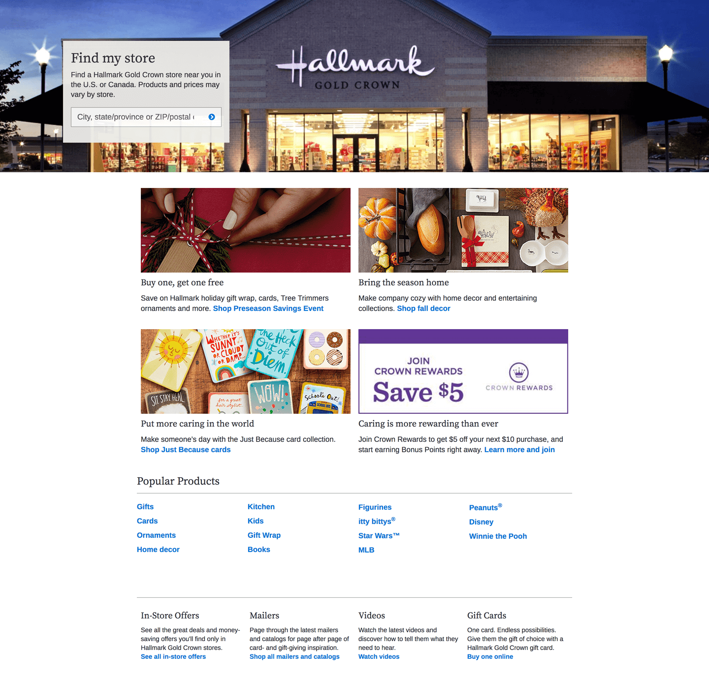
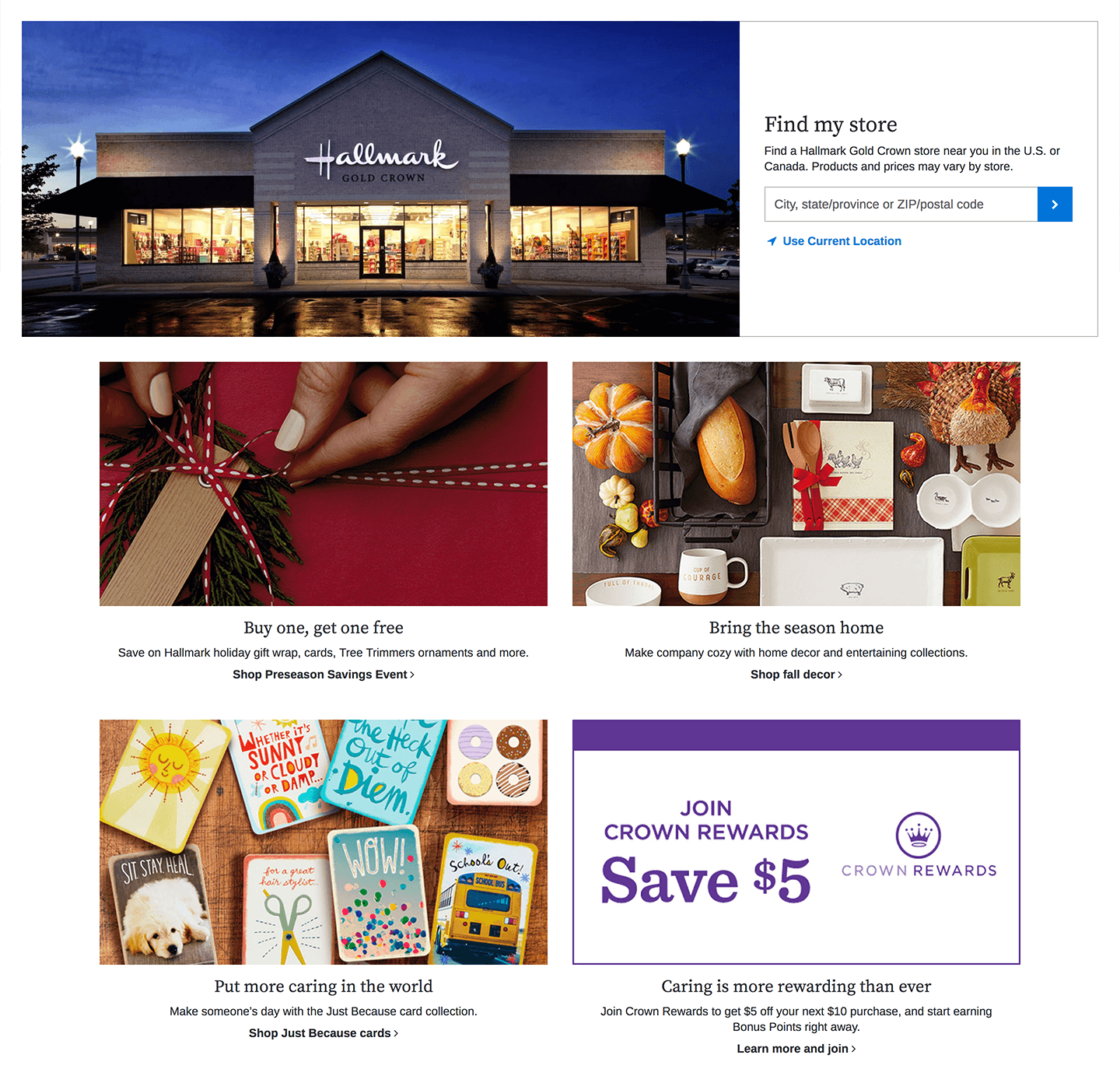
Stores page
The Stores landing page was using an old template. We updated the template, created custom HTML to support the Store Finder banner, used new components, and got rid of unnecessary content.
Efforts to meet accessibility standards across Hallmark.com in order to better serve and support all customers.
Role: UX/UI designer
This year the UI Engineering team helped prioritize and deliver several accessibility updates for Hallmark.com. These updates delivered on other technical standards related to site performance and responsiveness, making them more valuable to our customers and internal business partners. This body of work included updating outdated page templates and/or components. By migrating existing content into newer structures, we quickly addressed issues without needing to start from scratch. When content or structure was out of our control, we consulted with third-party vendors or external teams to make adjustments that met our standards.
I was fortunate to go to An Event Apart Boston in June, where I listened to a presentation by Derek Featherstone about inclusive design and how to fold that practice into user experience discovery and delivery. As the lead designer on many of the accessibility initiatives, I decided to create a checklist to help fellow designers keep accessibility in mind when designing features and creating content. The checklist serves as a starting point, providing a short list of reminders and links to tools or references. Reminders include topics like color contrast, focus states, non-color indicators, font sizes, text styles, and text spacing. We rely on the WCAG 2.1 AA reference for requirements and implementation techniques.
Occasions page
The Occasions page was using an old template and soon-to-be deprecated components. We updated the template and components, keeping page content and layout relatively the same.Old page
![]()

New page
![]()

Stores page
The Stores landing page was using an old template. We updated the template, created custom HTML to support the Store Finder banner, used new components, and got rid of unnecessary content.Old page
![]()
New page
![]()
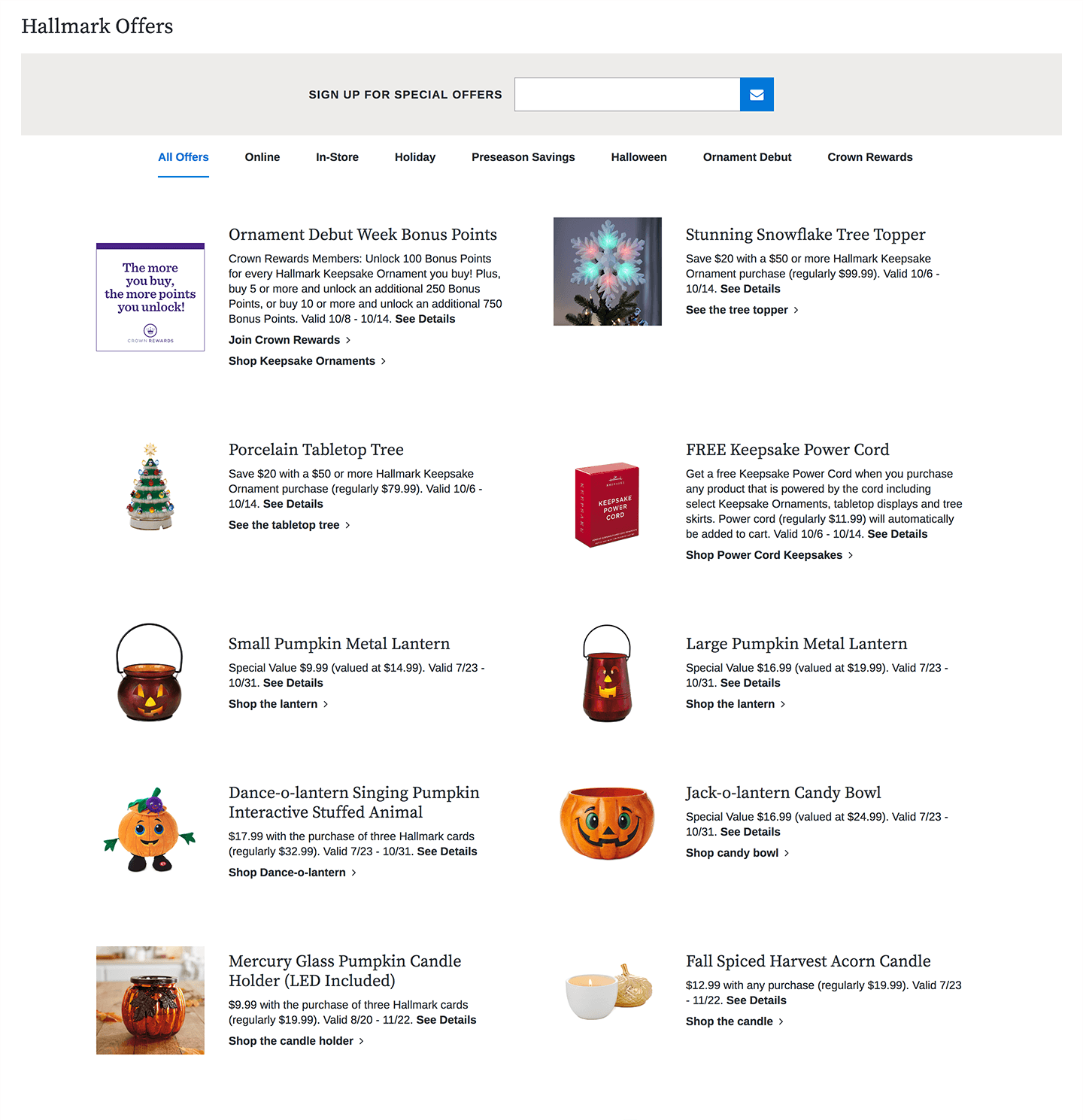
Offers page
The Offers landing page contained incorrect markup, outdated code, and legacy content. We integrated up-to-date components on the page, taking careful consideration to support existing content and logic.Old page
![]()
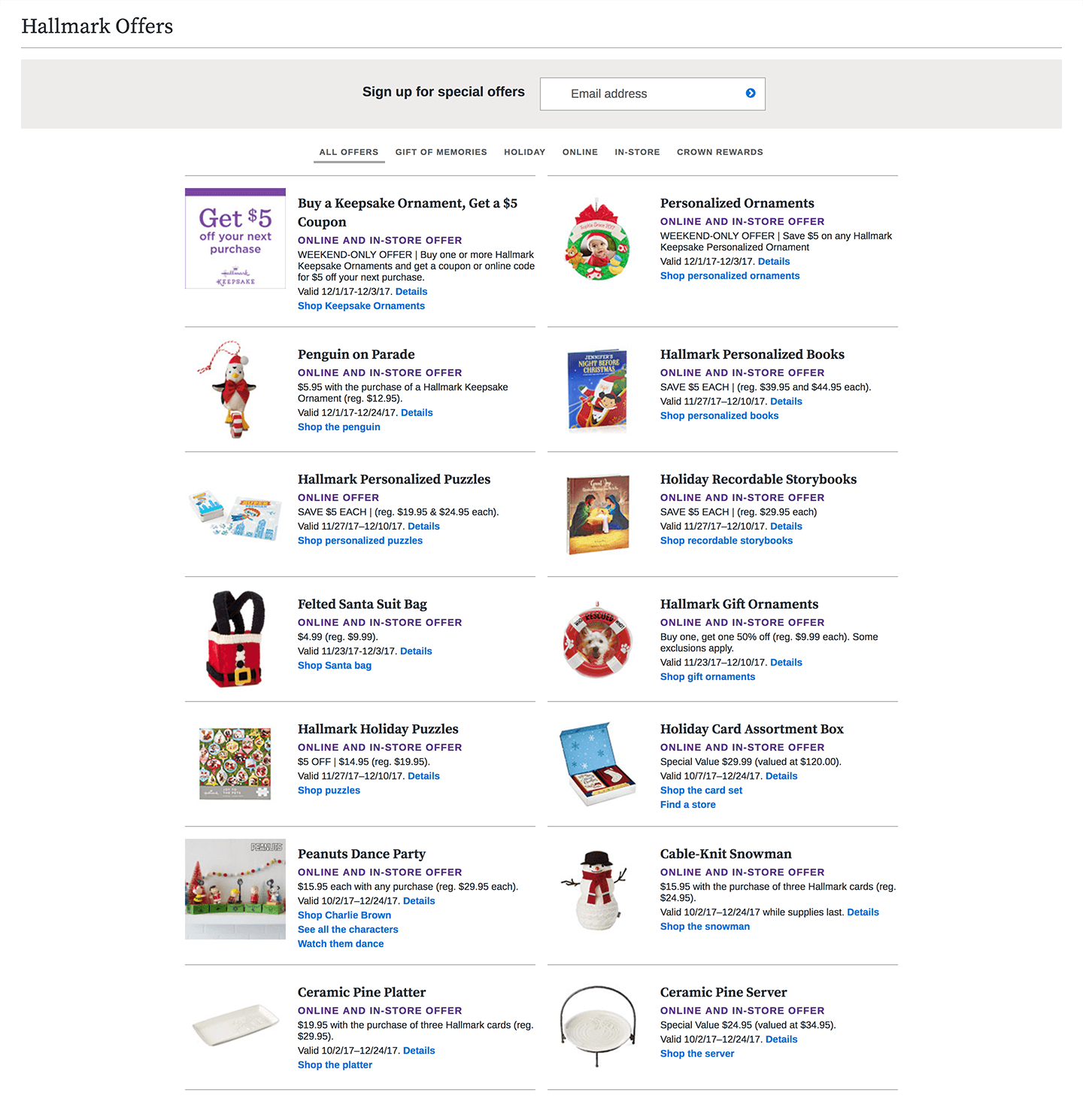
New page
![]()
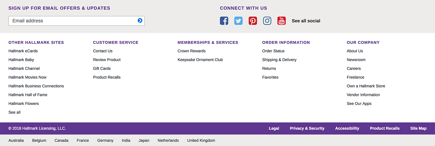
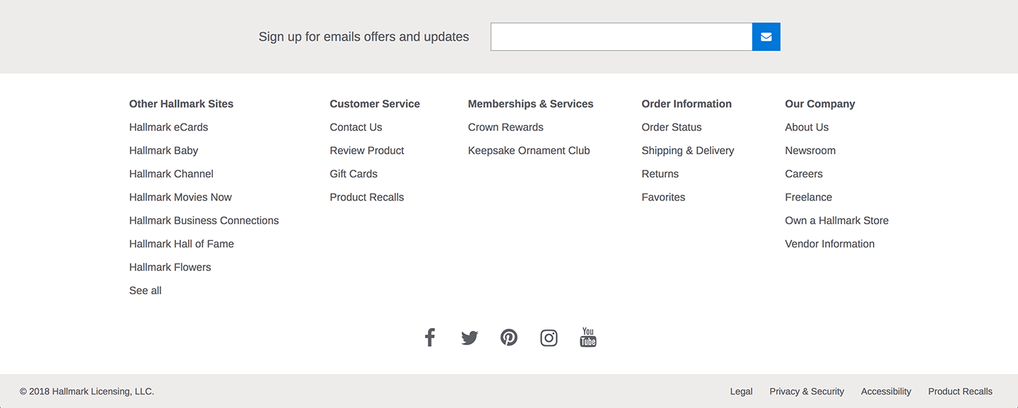
Footer
The Footer needed to be refactored so the structure would be up-to-date and accessible. We made some UI modifications as well, but kept most content and layout consistent.Old Footer
![]()
New Footer
![]()
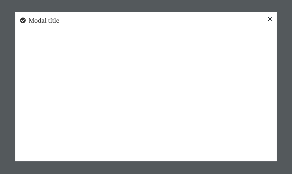
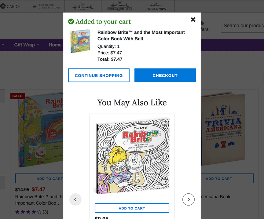
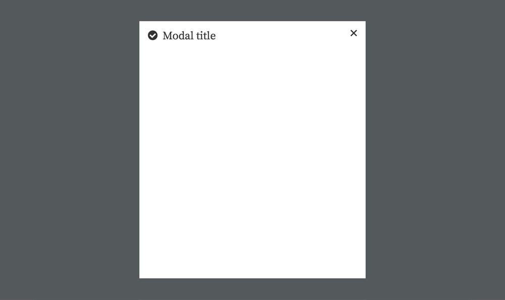
Modal component
We conducted an audit of all modal variations on our site in order to create one component that meets all content needs in an accessible way. After the audit was completed I refined UI direction for the modal, resolving typography, spacing, and content inconsistencies. Developers then created a scalable and accessible front end architecture for the modal. We are actively assisting in the integration of this new modal on a case-by-case basis driven by product squads.Example of outdated variations of the same modal

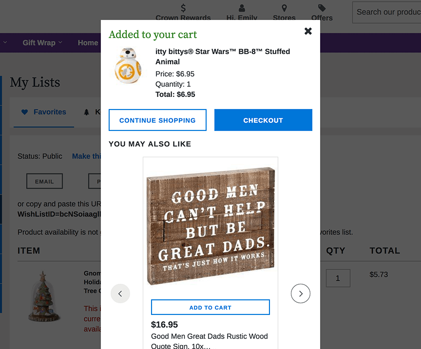
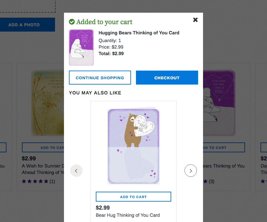
New modal component requirements and specs
- All modals have a title. Modal titles should utilize the same heading style.
- All modals have a way to close the modal. The x icon should be consistent.
- Add icon placeholder to title so we have the option to add an icon when necessary.
- Position: centered in the browser
- Min-width: 448px (1-column layout)
- Max width: 896px viewport percentage (2-column layout)
- Max height: 90vh
- Overlay: maintain existing overlay settings
- Mobile offset: 8px
1-column modal
![]()
2-column modal
![]()