Hallmark Category & Browse Redesign
2017Redesign and restructure of Hallmark.com Category and Browse page templates.
Goals:
- One page template that can support both browse and category page needs.
- A collection of flexible UI components to support robust content strategy.
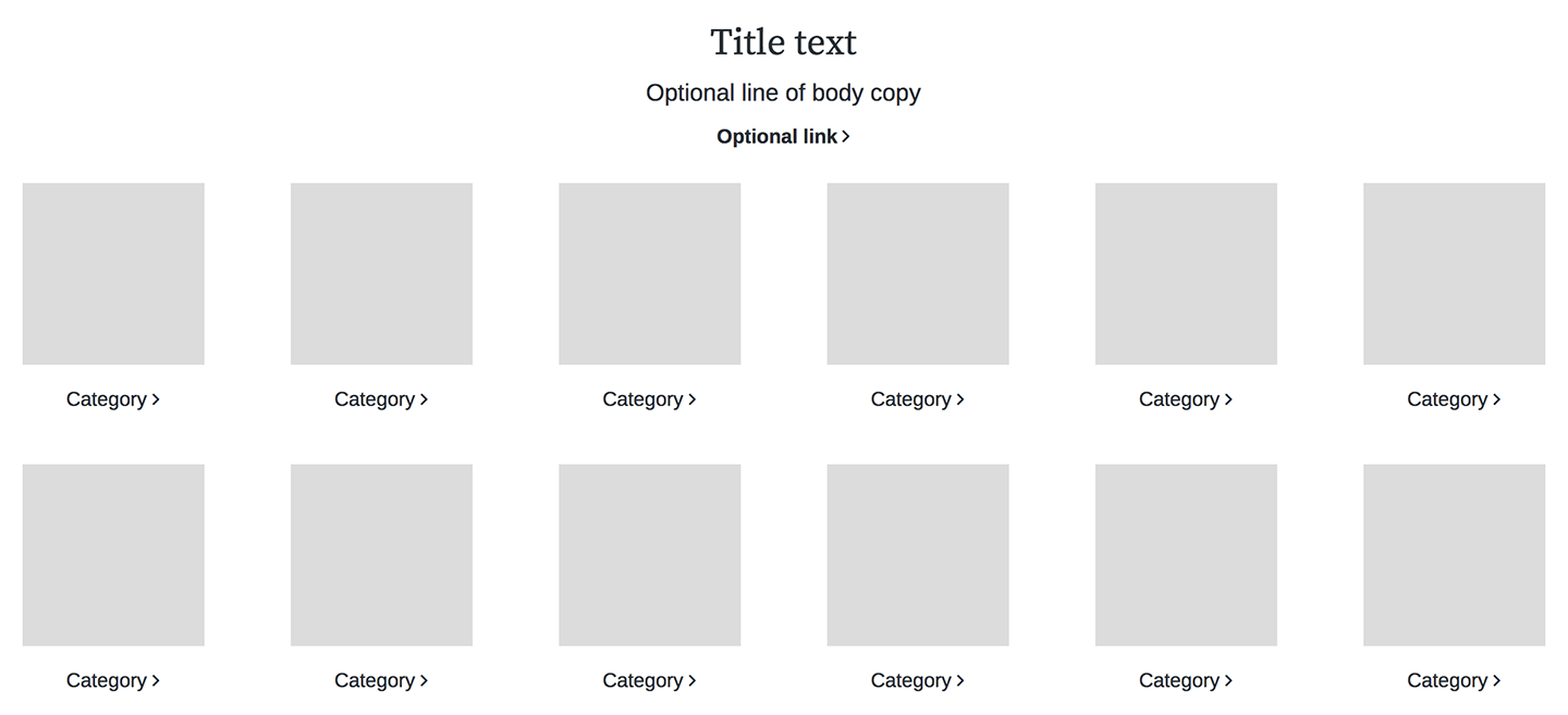
- One browse tile component that can support a variety of product types and content needs.
Role: UI designer
Tools: Axure, Photoshop
Hallmark.com was overdue for a design and structure update. One of the main issues with the existing structure was that we could not support creative content on pages with browse tiles. The two types of content had to exist as separate pages. Category pages contained all relevant category content (marketing, promotions, categories, etc). Browse pages contained product tiles to shop from and filters to narrow your search.
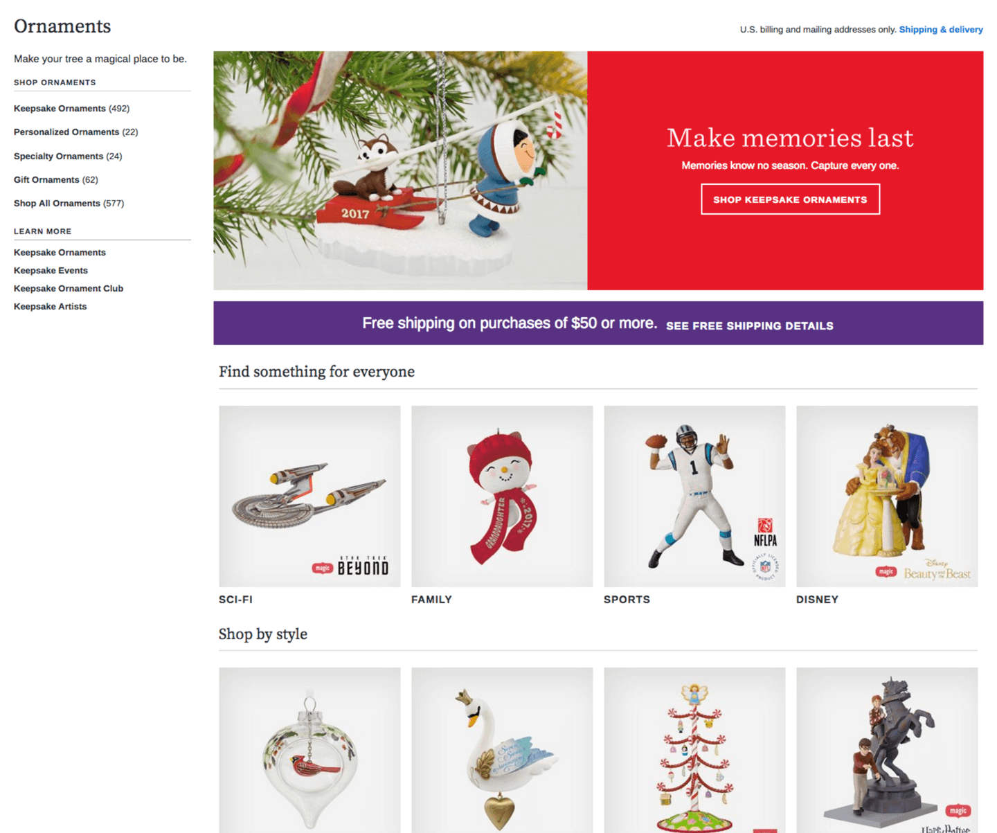
Old Catgory page
![]()
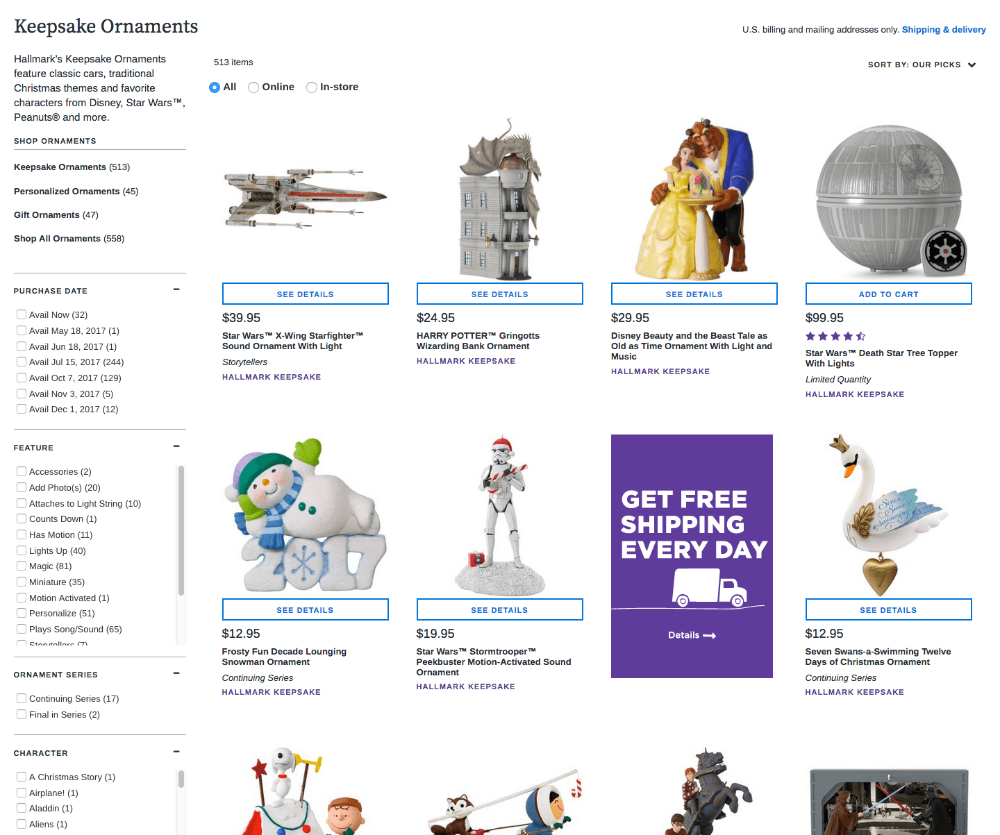
Old Browse page
![]()
The first task we prioritized was to rebuild the browse rendering template in order to support component-based design. This meant adding customizable content slots to the page that can be configured in our e-commerce platform. Running parallel to this work was the design of various components to populate the new slots.
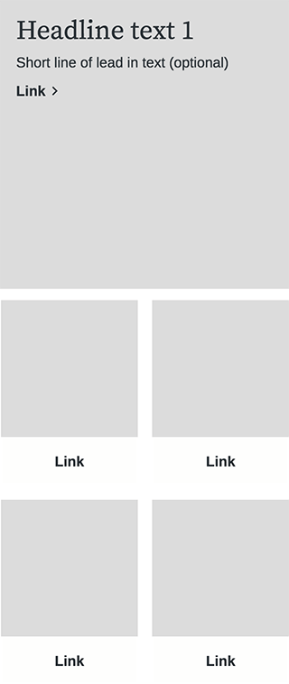
A sample of low-fidelity wireframes (combination of desktop & mobile layouts)


After user testing layout and content combinations, the winning components were fully designed, developed, and documented. This work included creating high-fidelity wireframes showing standard breakpoints and expected functionality, creating detailed development tickets, and QA testing throughout the development process.
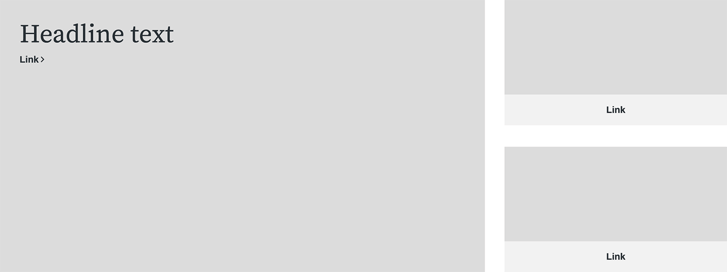
A sample of high-fidelity wireframes (combination of desktop & mobile layouts)

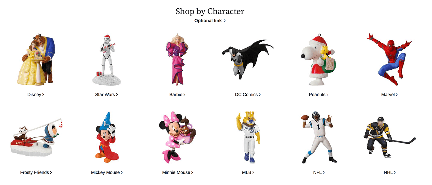
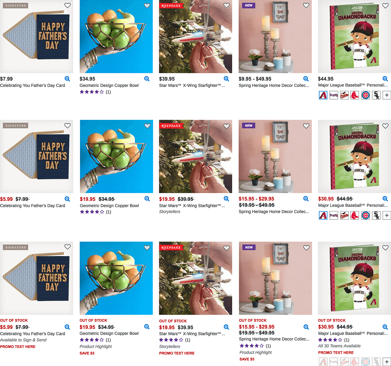
Next, we worked on browsing elements: tiles, filters, and navigation. For the browse tile component we needed to support different types of products and messaging. To help fuel the redesign, we hosted a design sprint with the goal of creating a browse tile that could effectively communicate product type, collection, quality, availability, and messaging. We went through several iterations to align on the final component.
Design sprint sketches

Design iteration
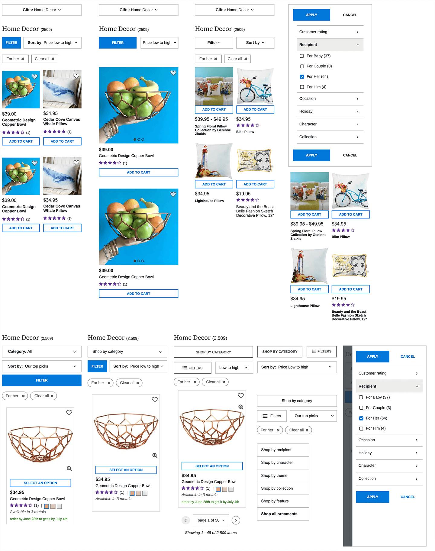
During this timeframe, we also focused on improving the filters and navigation. We evaluated current e-commerce standards and trends and went through several iterations.
Browse elements iterations
Overall we made dramatic improvements to Hallmark.com through the redesign of the category and browse pages (~2/3 of the site). The redesign contributed to a more user-friendly, flexible, and accessible site which enabled more consumer engagement and conversion.
After this redesign, we focused on content strategy for the new Category pages.